


Updated: 19 August 2019
In this post, Christopher Frye, a data science consultant and Kolabtree freelancer, provides the top open-source data visualization tools that can help you easily visualize and interpret complex data.
Data visualization tools help to house, cleanse, process and display the rapidly growing, vast and complex data that we generate and collect every moment. Data visualization facilitates decision-making processes that allow businesses to compete and adapt quickly to changing environments. The ever-increasing flow of data streams in both real-time and near real-time require the use of dynamic dashboards, driving the demand for sophisticated tools, platforms and applications. The most effective visualizations combine data cleansing and analytic techniques, and often require a competent data scientist. Nevertheless, there are a number of open source data visualization tools that can assist businesses with visualizing their data easily.
Open-Source Data Visualization Tools
Research conducted for this post revealed more than 50 data visualization tools that can be considered “open source”. Open source can sometimes generate a bit of confusion as being synonymous with “free”. The most basic definition of open source in the context of software is “software with source code that anyone can inspect, modify, and enhance”. Open source data visualization tools require the user to have some programming ability, whereas free visualization tools may not necessarily need the user to have programming ability. Tableau Public is an example of a free data visualization software, however, it is not open source. I have tried to cover some Tableau alternatives in this post.
This post profiles both free and open source data visualization tools, and includes a comparison matrix that can be used to compare and contrast each tool.
1. Candela
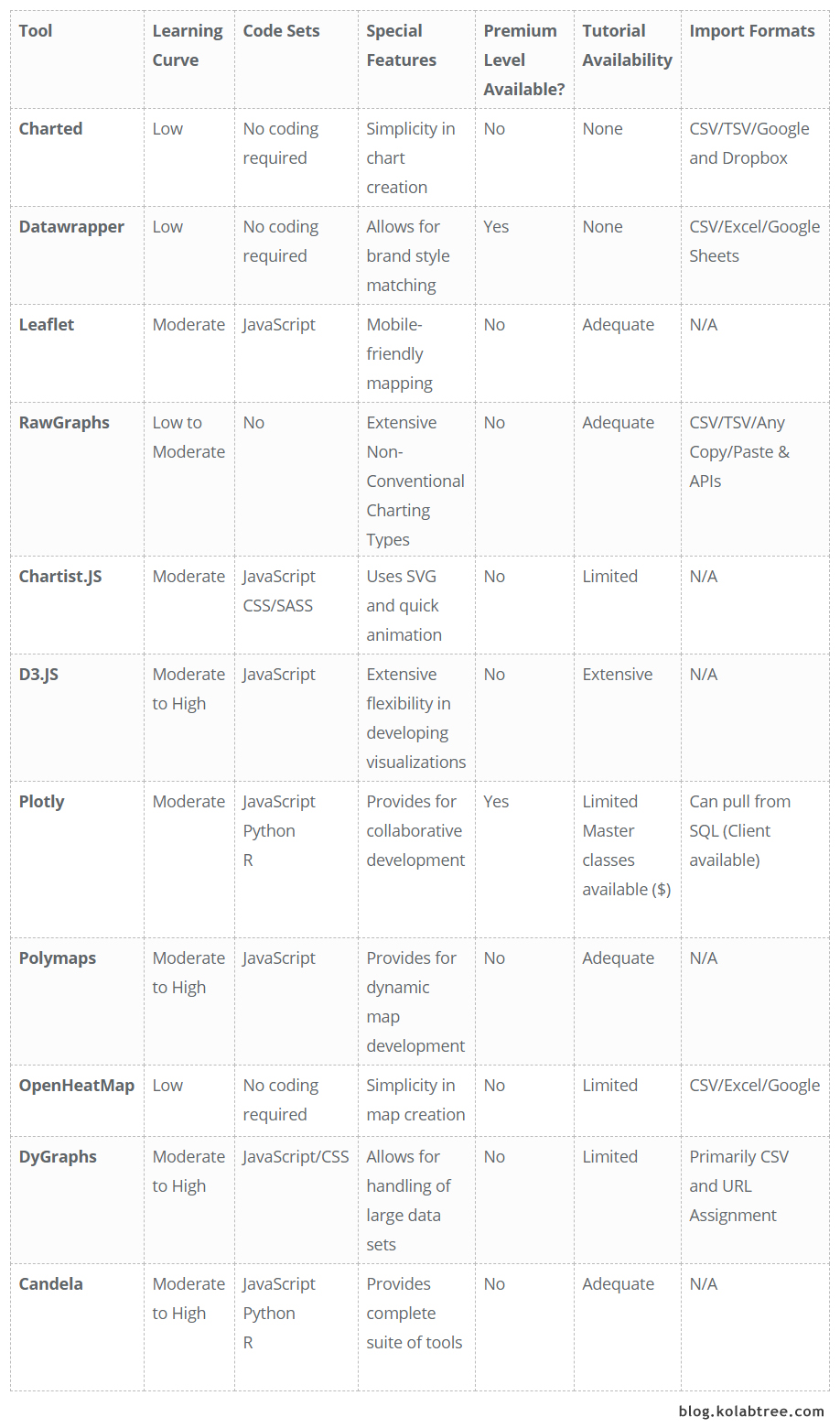
Candela is a data visualization package made available through the Resonant platform. Candela separates itself from other tools by providing a full suite of data visualization components. The training documentation provides for a quick start for novices to get up to speed, and code can be used via JavaScript, Python, or R. Installation of Candela locally can be done via the latest public release package through a repository, though tool documentation suggests installing the package from source as it will allow for the latest development release.
2. Charted
Charted is perhaps one of the easiest data visualization tools around, as it simply requires a link to a .csv file or a Google Sheets location; hit GO and Charted creates a visual display using a bar or line chart. According to the developers of Charted (created by the Product Science Team at Medium), the tool was built around three principles: it does not store data, does not transform data, and is not a formatting tool. It pulls data on a regular cadence (refreshes every 30 minutes) so changes made to the underlying sheet are always up-to-date in the chart. It also supports tab-delimited files and Dropbox links. Training? Non-existent, though neither is it required.
3. Datawrapper
Datawrapper is a tool that has been in existence since 2011 and is primarily used by journalists, though is comprehensive enough to be useful to any data scientist or researcher. In contrast to most of the tools profiled here, Datawrapper has free and paid versions. It’s also not technically open-source because no coding skills are needed. As the site home page explains, you simply cut & paste, visualize, and publish. Charts are interactive, meaning viewers can see underlying values, and the visualizations can also be embedded on a website. There is a wide range of charting options from simple bar charts to scatter plots, as well as mapping functionality.
In this week’s Weekly Chart, we praise #worldcup visualisations, bring symbols into dotplots and triple our data for better hover effects: https://t.co/uZoRwM5R81 pic.twitter.com/RHOYSlAsKL
— Datawrapper (@Datawrapper) July 5, 2018
4. Leaflet
Leaflet is all about maps. In fact, it has no charting capabilities but touts itself as the “leading open-source JavaScript library for mobile-friendly interactive maps”. The tool provides for a variety of mapping layers, and interaction features such as zoom controls, and mouseover functionality. There is also customization capability such as map projections and easy CSS3 restyling. Additional features can be provided via plugins, and users can vote for additional plug-ins if one is not available. There are both basic tutorials such as a quick start guide as well as more advanced training for plugin development. Install files can be accessed through a repository (both stable and in-progress versions) as well as through source code.
5. RawGraphs
Similar in some respects to Charted and Datawrapper, RawGraphs, whose tagline is the missing link between spreadsheets and data visualizations, simply requires the user to either cut/paste data, upload, or provide a link to create a wide variety of charts. One feature that differentiates RawGraphs is that a number of unconventional visualization models are provided (e.g. sunburst, alluvial diagrams, dendrograms for hierarchical clustering, etc.). Don’t fret, novices – the usual suspects (bar, line, pie, scatter) are also included. For advanced users, new chart types can also be created. Visual creations can be exported as vector or raster images for display on your website, and the tutorials, while not extensive, can be completed quickly so you can get right to work on that visual magnum opus.
6. Chartist.js
Chartist.js is another JavaScript library that embodies its tagline as Simple Responsive Charts. Indeed. No waterfalls or boxplots here, but what Chartist.js loses in diversity it more than makes up for in customization. Style sheets (CSS) can be customized to a great degree in this tool with customization allowing for animation of visualizations, some using SVG. What is SVG? SVG is scalable vector graphics, a format that allows for interactivity and animation, as well as being scalable (without loss of resolution quality). Chartist.js sees SVG as a cutting-edge technology, a vision apparently shared by others. There are some browser compatibility issues, but the site provides a concise table indicating compatible browsers.
7. D3.js
D3.js is yet another JavaScript library that develops data visualizations through the use of html, svg, and css. D3 stands for Data-Driven Documents, document here being a Document Object Model (DOM). The core idea behind D3.js is to leverage the full capability of the modern browser for the development of visualizations through web standards, without “tying yourself to a proprietary framework”. In terms of learning curve, this would be the polar opposite of other cut-and-paste tools, so D3.js is decidedly not for those that avoid the dreaded code moniker. That said, if you are looking for a tool that provides nearly unlimited functionality in terms of design creativity and charting options, D3.js might be just the ticket!
8. Plotly
Plotly’s new #Python interface: fast rendering of huge datasets, interactive #Jupyter notebooks, validation… This is huge! https://t.co/iRzERrUdQX by @jonmmease 👍 pic.twitter.com/VvnGdmgGEk
— Radim Řehůřek (@RadimRehurek) July 6, 2018
Plotly is another example of a tool that has both open-source and proprietary (paid) products, each tier containing its own functionality. Offerings can be grouped into two platforms (Plotly On-Premises and Plotly Cloud) with four primary business intelligence tools covering charting, dashboards, slide decks, and SQL client. The SQL client is free, while Plotly libraries are available as open-source through JavaScript, Python, and R. One of the oft-marketed features of Plotly (at least in the paid tools) includes the ability to collaborate and share data visualizations with other team members.
9. Polymaps
Similar to Leaflet, and as the name suggests, Polymaps is a tool consisting of a JavaScript library for “making dynamic, interactive maps in modern web browsers”. Polymaps is another tool that leverages SVG functionality, facilitating styling through CSS, and allows for increased interactivity. Examples of mapping visualizations include general street layer mapping, chloropleth maps (for instance, comparing state-level data), population density, and even the use of k-means clustering.
10. OpenHeatMaps
In the category of upload and create, OpenHeatMaps is a fairly basic tool that allows user to upload either a csv, excel, or Google Sheets file, and create a map instantly. OpenHeatMap can also be used by developers (as a JQuery plugin) to provide for mapping functionality within their own website. Users uploading a file for rendering are recommended to include a full street address in one field, with values represented in another field (for instance, housing value, sales price, number of employees, etc.). Geographies can be point-based (i.e. one address), or aggregates such as city, county, state, etc.
11. DyGraphs
DyGraphs claims as one of its primary features the ability to handle huge data sets, plotting millions of data points without “getting bogged down”. Another feature, for those who consider themselves stats nerds, is the ability to display error bars and/or confidence intervals. To use these, one standard deviation must be specified in the data file. The tutorial demonstrations are fairly basic but should serve to get someone started fairly quickly in creating their own visualizations.
Comparison Matrix
Kolabtree helps businesses worldwide hire freelance scientists and industry experts on demand. Our freelancers have helped companies publish research papers, develop products, analyze data, and more. It only takes a minute to tell us what you need done and get quotes from experts for free.

Unlock Corporate Benefits
• Secure Payment Assistance
• Onboarding Support
• Dedicated Account Manager
Sign up with your professional email to avail special advances offered against purchase orders, seamless multi-channel payments, and extended support for agreements.


